Brat Album Cover: Story Behind the Iconic Green Design
The Brat album cover is the primary artwork associated with Charli XCX’s sixth studio album, Brat. Released in June 2024, the album introduced a visual identity that was deliberately different from conventional polished pop imagery.
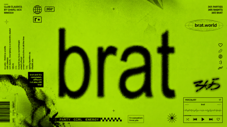
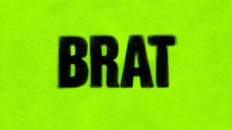
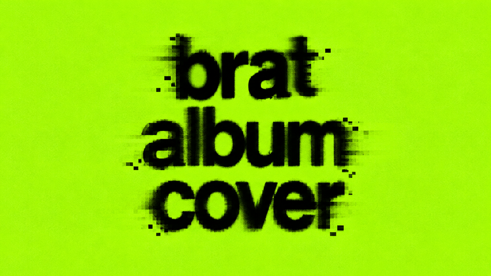
The central design consists of a bright lime-green background with the word “brat” displayed in lowercase black lettering. The letters have a somewhat rough and blurred appearance, creating a visual that feels imperfect rather than digitally pristine.
Instead of relying on a photograph of Charli XCX, the cover makes color and typography the main focus. This immediately gives the artwork a different character from many traditional pop releases.
The simplicity also makes the design easy to recognize. Even when the full album artwork is not visible, the distinctive green and lowercase word can immediately suggest the Brat era.
The Creative Idea Behind the Brat Cover
The apparent simplicity of the cover can make it seem like a quick graphic. However, the design reportedly involved months of creative development.
The artwork was create with the New York-base creative studio Special Offer, Inc., with designer Brent David Freaney and creative director Imogene Strauss among the people involve in its development.
One interesting aspect of the process is the amount of experimentation behind the final image. Freaney has discussed how the team explored numerous possibilities before arriving at the final combination of color, typography, and presentation.
This is an important lesson in minimalist design: removing elements does not necessarily mean removing creative work.
Minimalism With an Attitude
The Brat album cover uses minimalism differently from a clean corporate design. It does not try to look perfectly polished or luxurious.
Instead, the roughness is part of its personality.
The lowercase title, bright color, and imperfect treatment create something that feels casual, direct, and unconventional. The result is visually simple while still having a strong attitude.
This combination helped the artwork feel appropriate for an album that built much of its identity around individuality, confidence, imperfection, and contemporary internet culture.
Why Is the Brat Album Cover Green?
Color is arguably the most important visual element of the Brat album cover.
The particular green used for the artwork is bright, intense, and difficult to ignore. It does not resemble the soft pastels or dark colors commonly associated with many album designs. Instead, it immediately demands attention.
According to designer Brent David Freaney, the creative team explored hundreds of different green shades during the development process. The goal was to find a color that felt distinctive and somewhat uncomfortable rather than simply attractive.
That decision helped transform green into a recognizable part of the Brat identity.
It is worth noting that many unofficial recreations online provide HEX or RGB values for the color. These can be useful when making a Brat-style graphic, but they should not automatically be treated as an official technical specification of the original artwork.
The important design principle is the visual character: a highly saturated, vivid green paired with contrasting black text.
The Typography: Understanding the Brat Font
The typography on the Brat album cover is another major part of its identity.
Rather than using an ornate display font, the design uses simple lowercase lettering. The type treatment is associated with Arial-based typography, giving the word a familiar and straightforward appearance.
That choice is significant because the title itself becomes the visual centerpiece.
The word “brat” is not hidden in a corner or treated as secondary information. It occupies the artwork prominently, making the title almost function like a logo.
The lowercase treatment also contributes to the informal character of the design. Combined with the green background and imperfect appearance, it creates something that feels intentionally casual.
This simplicity is one reason the visual style became so easy for people to imitate. Someone does not need advanced graphic-design skills to understand its basic formula.
Why Does the Brat Album Cover Look Blurry?
One of the most recognizable details of the artwork is its slightly blurred or low-resolution appearance.
Instead of perfectly sharp typography, the letters have a rough quality that makes the cover feel less polished than conventional digital artwork.
According to Freaney’s later explanation of the design process, the final blurred appearance was connected to a low-resolution screenshot export. What could have remained an ordinary technical detail ultimately became an important part of the finished visual identity.
The result works because the imperfection feels intentional when viewed alongside the rest of the design.
Rather than correcting every visual irregularity, the artwork embraces a less polished appearance. That approach became an important part of the broader Brat aesthetic.
How Was the Brat Album Cover Created?
Creating the final artwork involved more decisions than the finished image might suggest.
The creative team experimented with colors, typefaces, composition, and visual treatment. The goal was to create something that was simple enough to be immediately understood but distinctive enough to stand apart from other album covers.
Color was carefully considered, with hundreds of green shades reportedly explored.
Typography also played an important role. The designers had to determine how the lowercase title should appear, how large it should be, and how its treatment would interact with the green background.
The final result demonstrates an important principle of visual branding: a strong identity can emerge from only a few carefully controlled elements.
What Does the Brat Album Artwork Mean?
There is no single interpretation that every viewer has to apply to the cover.
From a design perspective, however, several ideas can be observed.
The cover rejects the expectation that a major pop album needs a complicated photograph or elaborate illustration. Instead, it places an ordinary-looking word against an aggressive color.
The imperfect treatment also challenges conventional ideas about polished branding.
Charli XCX has discussed the broader expectations surrounding pop-star imagery and album artwork, including the expectation that female artists should prominently feature their own image. The absence of a conventional portrait therefore became part of the conversation surrounding the artwork.
Fans and commentators have also developed their own interpretations of the cover’s meaning. These interpretations can differ, so it is useful to distinguish documented statements from personal readings of the design.
From Album Artwork to Internet Culture
The Brat album cover became particularly effective in the age of social media because its visual formula was extremely easy to understand and reproduce.
A person could create a variation by using a green background and replacing the original word with their own text.
This flexibility helped the aesthetic move beyond the album itself.
People adapted the visual language for memes, social-media posts, jokes, fan artwork, profile graphics, promotional material, and other forms of online content.
The design could communicate a connection to Brat without requiring a complicated illustration. The green background alone became an important visual signal.
This is one reason the cover had such strong potential as an internet meme format: it provided a recognizable template while leaving plenty of room for customization.
The Brat Aesthetic Beyond the Album Cover
The Brat visual identity eventually became larger than the album artwork.
The combination of vivid green, black lowercase text, rough typography, and intentionally imperfect presentation appeared in many different forms of promotional and fan-created content.
The aesthetic could be adapted to different words, messages, and situations while still retaining a connection to the original visual language.
This demonstrates the difference between an album cover and a visual identity.
An album cover identifies a specific release. A strong visual identity can provide a design language that people continue to recognize and reinterpret across different formats.
How to Create a Brat-Style Album Cover
Creating a graphic inspired by the general visual characteristics of the Brat cover does not require complicated software.
Step 1: Choose the Background
Begin with a vivid lime or acid-green background. The color should be bright enough to create an immediate visual impact.
Step 2: Add Your Text
Choose a short word or phrase and write it in lowercase. Keep the text prominent rather than filling the design with multiple elements.
Step 3: Select a Simple Typeface
Use a clean sans-serif or Arial-like typeface. The goal is to keep the typography simple and recognizable.
Step 4: Add an Imperfect Effect
Experiment with subtle blur, softness, texture, or reduced resolution to create a rougher appearance.
The effect should support the design rather than make the text impossible to read.
Step 5: Adjust the Composition
Try different text sizes and positions. The title should remain the main visual element.
Once the composition feels balanced, export the graphic in a suitable format for your intended use.
Brat Album Cover Generator: A Faster Way to Experiment
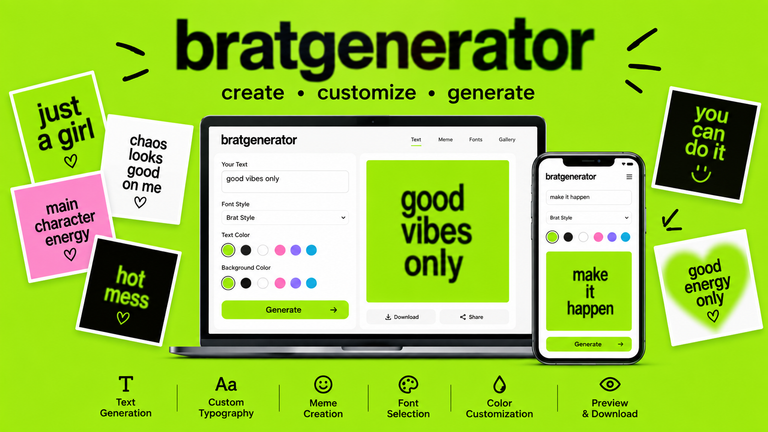
A Brat album cover generator can make this creative process easier for people who do not want to build the design manually.
Instead of starting with a blank canvas, users can enter their own text and experiment with the basic elements of the aesthetic.
A typical workflow can include:
- Enter your text.
- Choose a green background.
- Select a suitable font.
- Adjust text size and position.
- Experiment with visual effects.
- Preview the result.
- Generate the final graphic.
This type of tool can be useful for memes, social-media graphics, fan projects, playlist artwork, and personal creative experiments.
The important distinction is that a user-created graphic can be inspired by the general design language without being presented as the original official album artwork.
Brat Album Cover vs. Traditional Pop Album Artwork
The Brat design takes a noticeably different visual approach from many conventional pop covers.
| Feature | Brat-Style Cover | Traditional Pop Artwork |
| Main focus | Typography and color | Photography or illustration |
| Background | Strong single color | Often varied |
| Typography | Large lowercase title | Frequently secondary |
| Artist image | Not the central element | Often prominent |
| Complexity | Minimal | Can be highly detailed |
| Recreateability | Relatively simple | Often more complex |
Neither approach is inherently required for successful album artwork. They simply demonstrate different ways of creating a visual identity.
Why the Design Continues to Be Recreated
The lasting appeal of the Brat album cover comes partly from its simplicity.
It uses a small number of elements but makes each one highly noticeable. The unusual green attracts attention, the lowercase title is easy to recognize, and the imperfect appearance gives the design personality.
Most importantly, the basic formula is easy to adapt.
Someone can replace the original text with a name, joke, phrase, or meme while preserving the general visual structure. This flexibility makes the aesthetic particularly suitable for internet culture.
The artwork also demonstrates how minimalism can become memorable when color, typography, and composition work together.
Frequently Asked Questions
Why is the Brat album cover green?
The creative team experimented with numerous shades of green before selecting the distinctive color used for the final artwork. The unusual shade became a central part of the album’s visual identity.
What font is used on the Brat album cover?
The typography is associated with Arial-based lettering. Its simple lowercase treatment helps make the title the primary visual element.
Why does the Brat album cover look blurry?
The artwork has a deliberately imperfect appearance. Designer Brent David Freaney has explained that the final blurred look was connected to a low-resolution screenshot export during the design process.
Who designed the Brat album cover?
The artwork was developed through the creative team at Special Offer, Inc., with Brent David Freaney and creative director Imogene Strauss among those involved in the project.
Can I make my own Brat-style album cover?
Yes. You can create a design inspired by its general visual characteristics using a green background, lowercase text, simple typography, and subtle imperfections. A dedicated generator can also simplify the process.
Conclusion:
The Brat album cover shows how a remarkably simple combination of color and typography can develop into a powerful visual identity.
Its vivid green background, lowercase lettering, imperfect appearance, and lack of conventional album photography helped it stand apart. Behind that simple result was a lengthy creative process involving experimentation with color, typography, and presentation.
More importantly, the design proved highly adaptable. Fans and internet users could reproduce and customize the basic concept, allowing the visual language to spread far beyond the original album artwork.
Whether you are interested in album design, typography, internet culture, or creating your own graphics, the Brat cover offers a clear example of how simple design choices can become instantly recognizable when they work together consistently.