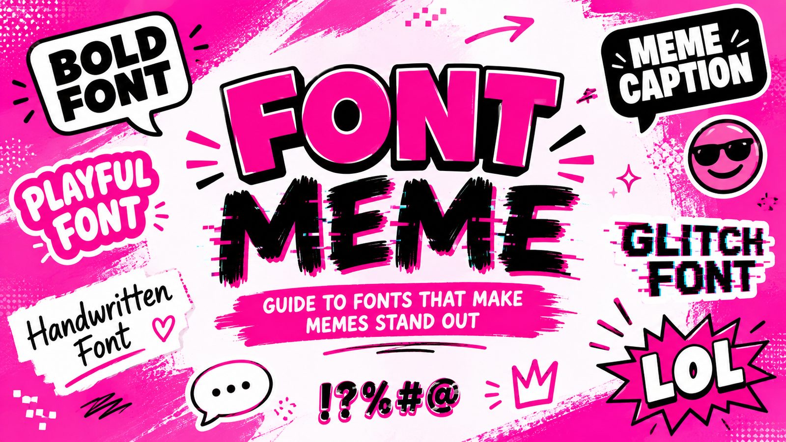
Font Meme: Guide to Fonts That Make Memes Stand Out
A font meme is more than an image with words placed on top. The typography can influence how people understand the joke, emotion, or message behind the image. A bold typeface can make a simple statement feel dramatic, while a playful style can turn an ordinary sentence into something humorous.
Today, meme creators have access to countless font styles, text effects, and customization options. From classic bold captions to distorted, glitchy, and decorative text, the right typography can give a meme its own personality.
Whether you are creating reaction memes, gaming jokes, social media posts, or absurd internet humor, understanding how meme fonts work can help you create content that is easier to read and more memorable.
Why the Font Is Part of the Meme
Images usually get most of the attention in a meme, but the text often delivers the actual punchline. Font selection affects how quickly the viewer understands the message and what emotional response the text creates.
Imagine the same phrase written in two completely different styles. A heavy, bold font may make the phrase feel serious or exaggerated. A handwritten style could make it feel casual. A distorted font might give it a strange or chaotic personality.
This is why typography should not be treated as an afterthought.
Good meme typography supports the image instead of competing with it. The text should be noticeable enough to understand immediately while still fitting naturally into the overall composition.
The Anatomy of a Great Meme Font
A successful meme font does not necessarily need to be unusual. In many cases, the most effective option is simple, bold, and highly readable.
Readability at a Glance
Memes are usually consumed quickly. People may see one while scrolling through a social media feed, so the text needs to communicate the message almost instantly.
Letters should remain recognizable even when the image is viewed on a small phone screen. Extremely decorative fonts can look interesting but may make the joke difficult to understand.
Boldness and Visual Impact
Bold typography works well because it creates a strong visual hierarchy. Important words can immediately attract attention and guide the viewer toward the punchline.
However, making everything extremely bold can reduce the impact. Highlighting only the most important words can create a stronger result.
Letter Spacing and Line Height
Spacing can dramatically affect how meme text looks. Crowded letters can become difficult to read, while excessive spacing can make the text feel disconnected.
Line height matters too, particularly when a meme contains multiple lines. Proper spacing keeps the composition organized.
Contrast Between Text and Background
A font can be perfect stylistically but still fail if it does not contrast with the background.
Dark text generally needs a lighter background, while light text works better against darker areas. Outlines, shadows, or background boxes can also help text remain readable over detailed images.
Meme Fonts Have Different Personalities
There is no single font that works for every meme. Different styles communicate different moods.
| Meme Style | Font Character | Best For |
| Classic | Bold and simple | Traditional memes |
| Internet Humor | Casual and expressive | Reaction memes |
| Absurd | Oversized and unusual | Surreal humor |
| Dark Humor | Heavy and dramatic | Dark-themed content |
| Minimal | Clean and modern | Simple captions |
| Chaotic | Distorted or unusual | Glitch memes |
Choosing a font based on the personality of the meme can make the final design feel more intentional.
A simple joke may benefit from clean typography, while a chaotic meme can work better with oversized, distorted, or unusual lettering.
From Classic Captions to Modern Meme Typography
Meme typography has changed as internet culture has evolved.
Older image macros often relied on highly recognizable bold caption styles. The goal was straightforward: make the words visible against the image and deliver the joke quickly.
Modern memes are much more varied. Social media creators experiment with lowercase text, minimalist layouts, handwritten styles, colorful typography, unusual spacing, and intentionally distorted characters.
Short-form video has also influenced meme typography. Captions are frequently designed to appear quickly, emphasize specific words, or match the timing of a reaction.
This means meme fonts are no longer limited to one visual formula. The style can change according to the platform, audience, image, and type of humor.
How Meme Typography Changes the Meaning
Typography can completely change the personality of the same sentence.
For example, imagine the phrase:
“Everything is fine.”
In a clean, small font, it might appear calm and understated.
Huge bold letters, it could become exaggerated and comedic.
In a distorted font, it could suggest chaos or something going wrong.
In a playful handwritten style, it might feel casual or sarcastic.
The words have not changed, but the typography changes how the viewer interprets them.
This is one reason font selection is so important in meme creation. Typography acts almost like a visual tone of voice.
Choosing a Font Meme Style for Your Content
The best meme font depends on the message you are trying to communicate.
Match the Font to the Joke
Start by identifying the emotion behind the meme. Is it funny, sarcastic, dramatic, confusing, creepy, or absurd?
Choose typography that supports that emotion instead of fighting against it.
Consider the Image
Look at the image before selecting the font. A busy photograph may require a simple, highly readable typeface. A minimalist background gives you more freedom to experiment.
Keep Important Words Dominant
If the meme has a punchline, make the key part visually noticeable. You can increase its size, change the style, or use a contrasting effect.
Don’t Sacrifice Readability
Creative typography is useful, but readability should remain a priority. If viewers need to decode the text before understanding the joke, the effect may become less effective.
When Ordinary Fonts Are Not Enough
Some memes require more unusual text effects. This is where experimental typography becomes useful.
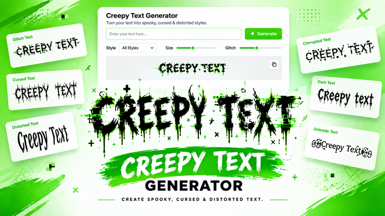
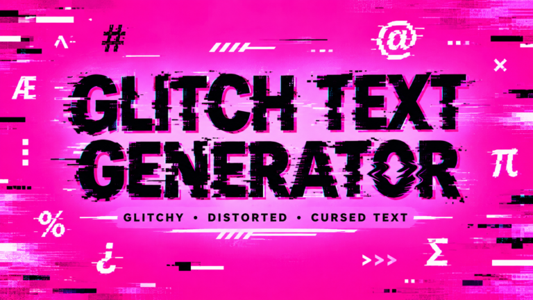
Glitch text can create a digital or corrupted appearance. Cursed text can make ordinary words look strange and unsettling. Distorted text can give a meme an intentionally chaotic appearance.
Unicode-based effects can also create unusual visual results by combining characters and marks. These styles can work particularly well for horror memes, gaming content, internet culture, and experimental designs.
Brat-style typography is another creative direction for bold, minimal meme graphics. Strong colors, simple lettering, and an intentionally imperfect appearance can make the design immediately recognizable.
The key is to use these effects intentionally. A strange font should contribute to the meme rather than simply making the text harder to read.
Font Meme vs Meme Font Generator
A font meme can refer to the typography style used within a meme, while a meme font generator is a tool designed to help users create customized text or meme graphics.
| Feature | Font Meme | Meme Font Generator |
| Main purpose | Explore or discuss meme typography | Create customized meme text |
| Font selection | Usually manual | Often built into the tool |
| Customization | Depends on the design | Usually includes multiple options |
| Text effects | May be limited | Can include special effects |
| Best for | Inspiration and style | Creating finished content |
A generator can make experimentation much faster because users can try different font styles, sizes, effects, and layouts without manually designing every element.
Build Better Meme Text in a Few Simple Steps
Creating effective meme typography does not have to be complicated.
- Start with your message. Decide what the meme needs to say before choosing a font.
- Decide the emotion. Determine whether the content should feel funny, serious, dramatic, sarcastic, creepy, or chaotic.
- Pick a typography style. Select a font that supports the personality of the meme.
- Adjust the size and positioning. Make sure the text is visible without covering important parts of the image.
- Check contrast. Make sure the letters remain readable against the background.
- Preview the result. Look at the meme at the size people are likely to see it.
- Save or share the finished design. Once everything looks balanced, your meme is ready for its intended platform.
Meme Font Ideas for Different Situations
Different types of memes can benefit from different typography choices.
Reaction memes: Bold, simple fonts usually work well because the viewer needs to understand the reaction quickly.
Gaming memes: Heavy or futuristic styles can complement gaming screenshots and competitive humor.
Relationship memes: Casual, handwritten, or clean fonts can create a more personal feeling.
Work memes: Simple typography keeps office jokes easy to understand.
School memes: Playful fonts can work well for relatable student humor.
Pet memes: Large, friendly, or humorous typography can complement expressive animal images.
Horror memes: Distorted, corrupted, or creepy text can reinforce an unsettling atmosphere.
Absurd memes: Unusual sizing, spacing, and intentionally chaotic fonts can enhance surreal humor.
The important thing is consistency between the typography and the idea.
The Future of Meme Typography
Meme creation continues to become more visual and customizable. AI tools, online generators, animated text, custom effects, and personalized templates are making it easier for creators to experiment with typography.
Instead of relying on one standard meme format, users can create designs around their own visual identity. Glitch effects, animated captions, unusual Unicode characters, and custom layouts are becoming useful creative options.
This evolution means meme typography is likely to become even more flexible. The basic goal, however, will remain the same: communicate an idea quickly and make the content memorable.
FAQs About Font Meme
What font is commonly used for memes?
Many memes use bold, highly readable fonts because they remain clear on different image sizes and screens. However, there is no single font that is required for every meme.
What makes a good meme font?
A good meme font should match the mood of the content while remaining easy to read. Strong contrast, suitable sizing, and appropriate spacing can also improve the final result.
Can I create meme text without an image?
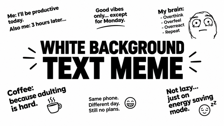
Yes. Meme text can be created as standalone typography using a plain background, colored canvas, or simple graphic layout. This approach works especially well for short jokes and text-based social posts.
What is a meme font generator?
A meme font generator is an online tool that allows users to create or customize text using different font styles, sizes, colors, and effects. It can make the process of experimenting with meme typography faster.
Conclusion
The right font can turn ordinary words into a recognizable part of a meme. Whether you prefer classic bold captions, clean modern typography, playful lettering, or distorted glitch effects, the best choice depends on the personality of your content.
Experiment with different styles, sizes, spacing, and effects until the typography feels connected to the joke. Most importantly, keep the message easy to understand.
With the right combination of words and visual style, a simple font can become one of the strongest elements of a memorable meme.